Reimagining the Indian Train Booking Experience
Redesigning the UTS app to simplify booking, improve usability, and enhance travel convenience for millions.
Name
UTS
Service
User Experience (UX) Design
Date
May 2023


How might we redesign the UTS app to offer a fast, reliable, and intuitive way to book and manage train journeys, without making users jump between multiple apps or screens?
Brainstorming & digging through what users really think
I dove headfirst into a sea of App Store reviews — the good, the bad, and the painfully relatable. These raw, unfiltered rants and cries for help helped me spot patterns, frustrations, and golden insights that shaped the redesign. Because sometimes, the best UX research lives in 1-star reviews.


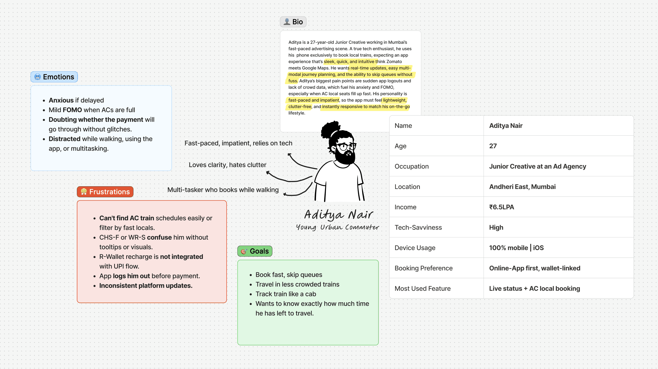
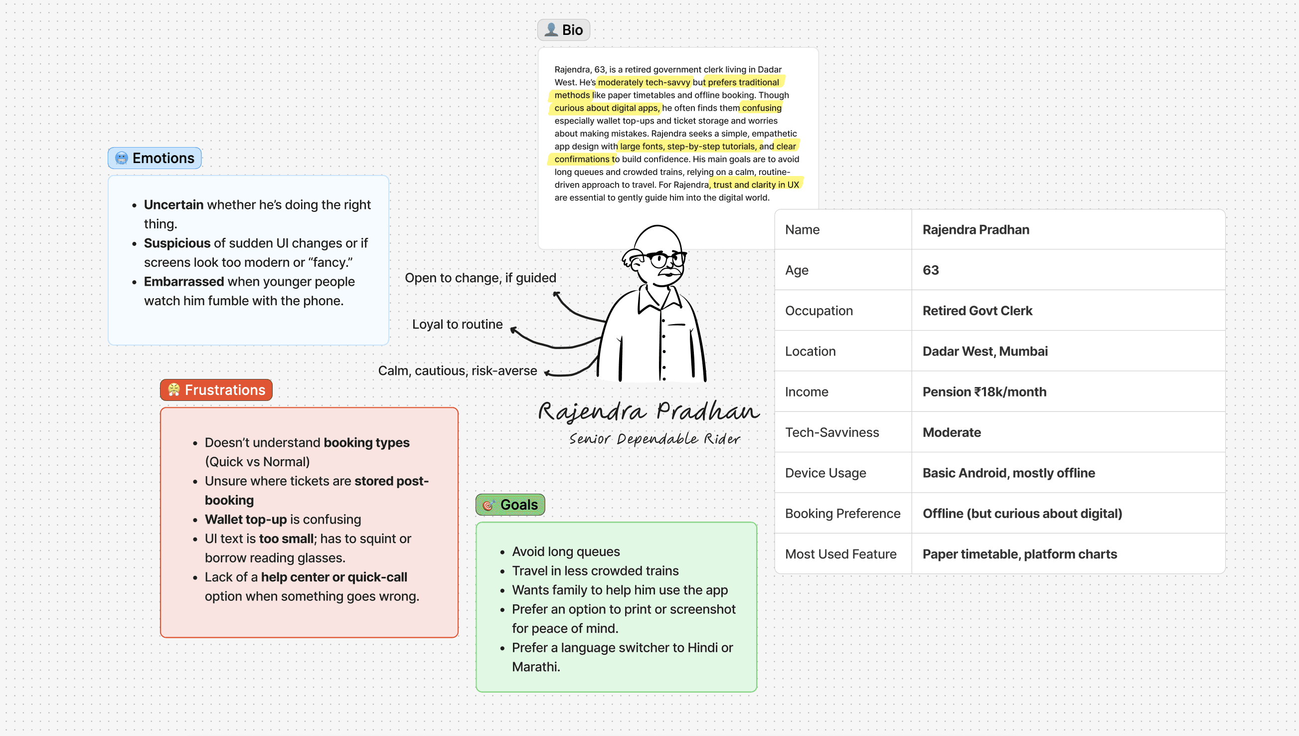
To capture a spectrum of real-world commuter behavior, I’ve selected two personas representing distinct age and tech engagement brackets:
Aditya Nair – a 28-year-old tech-savvy professional who frequently uses mobile apps.
Rajendra Pradhan – a 62-year-old retired government employee with limited digital fluency.
This contrasting lens allows us to understand the UTS app through both a digital native’s efficiency lens and a cautious, accessibility-seeking user's perspective. Designing with both in mind ensures the experience is inclusive, intuitive, and robust.


By building a unified, no-fuss platform that blends ticket booking, live train updates, and navigation into one smooth ride where your most-used routes are remembered, your payments just work, and your train info lives right where your ticket does.

Cognitive Overload & Inefficient Task Hierarchy
"It feels like I have to decode the screen every time."
Problem
No visual hierarchy, everything feels equally important.
Key actions like ticket booking/checking aren’t prioritized, despite being used by 90% of users.
Bureaucratic labels confuse (“Quick” vs “Normal” Booking).
No personalization—routes, stations, and preferences aren’t saved.
Rebooking is unnecessarily multi-step.
Solution
Introduced a 'Frequently Travelled' section that smartly surfaces commonly booked routes with pre-filled details, cutting down repeated input and speeding up the booking process.
Added a location-based station detector to automatically show the nearest station, helping users avoid switching to Google Maps and saving time on manual entry.
Displayed any active tickets directly on the homepage so users can instantly access their current journey info without digging through tabs during checks.
Implemented persistent login flow where users remain signed in unless they change SIM or uninstall the app, eliminating annoying re-logins.
Grouped key actions and simplified CTAs on the homepage to reduce cognitive load and allow faster decision-making by highlighting the most-used features.
Enabled offline ticket visibility with an on-screen indicator to ensure users can always access their ticket even when there's no mobile network.
Broken Payment Journey & Redundant Entry
"It keeps taking me to some external page. Why not just show UPI here itself"
Problem
Payment pages often fail or timeout, disrupting the booking flow.
No option to save UPI or card details for faster checkout.
Users must manually re-enter payment info for repeat bookings.
High drop-off rate at the payment stage due to slow and untrustworthy experience.
Breaks user rhythm by forcing last-minute transitions outside the app.
Solution
Introduced a clear ticket summary page post “Book” click to prevent accidental errors and ensure user confirmation before payment.
Displayed fare breakdown upfront for pricing clarity and confident decision-making during the transaction.
Smart payment method recommendations now surface based on previous user behavior, removing friction and guesswork in selection.
Persistent wallet visibility with real-time balance display allows users to keep track of funds without leaving the flow.
Enabled saved payment methods so users can checkout faster without re-entering details every single time.
One-tap UPI integration allows users to reuse recently used UPI apps or IDs, making the experience frictionless and familiar.
Unreadable Ticket Design & Lack of Validity Awareness
“I forgot my pass was expired. Got fined for it.”
Problem
Poor visual hierarchy makes it difficult to quickly find important details like validity, route, or class
No clear status indicator—users can’t easily tell if a ticket is active, expired, or upcoming
Season pass expiry information is buried inside submenus, often leading to missed renewals and fines
Hard to locate your ticket when there is no network
Solution
Tickets load even without a network connection, ensuring commuters aren't stranded in poor signal zones.
Accessing your ticket is now just one tap away via the bottom navigation bar, eliminating long paths or hunting through menus.
An expandable E-Ticket view clearly reveals the QR code when needed, and collapses back for quick reference.
Disconnected Experience Between Location and Booking
“I got on at the wrong station a booked a ticket for a different station”
Problem
The UTS app offers zero spatial awareness—users are forced to switch between Google Maps and UTS just to figure out where their nearest station is.
Users often need to toggle between multiple apps or even ask strangers to confirm station distances or directions.
You can’t check what trains are departing soon from your nearest station unless you go back to the booking flow.
Solution
Auto-detects and displays the nearest station based on your GPS, including distance from your current location.
Integrated in-app train map eliminates the need to switch between UTS and Google Maps.
Seamless booking directly from the station card—no need to jump to a separate screen.
Clickable station markers reveal key amenities.
Real-time updates for upcoming trains from that station, complete with platform info and delay status.
Entire journey from orientation → discovery → booking is unified in one interactive, intelligent map layer.
No Central View of Available Trains, Users Rely on External Apps to Plan
“The train was late, but I had no clue when it’d arrive. Lost precious time.”
Problem
No integrated platform information, users must ask around or switch to other apps like M-Indicator.
No live countdowns or indicators showing which train is arriving next from their current or nearby station.
No personalization—there’s no memory of frequently searched routes or preferences (e.g., “Show only AC locals”).
Solution
Integrated local train schedules directly into the app, no more switching to M-Indicator.
Introduced effortless toggles to filter between AC, Fast, Slow, and Express trains.
Added color-coded, labeled badges (AC / Fast / Slow) for instant visual scanning and reduced cognitive load.
Replaced cryptic train names with clear, human-readable journey routes like “Borivali → Churchgate.”
Displayed live train status and real-time delay indicators to help users plan more accurately.
Designed intuitive train cards that summarize key details—arrival time, departure, platform, and type—all in one glance.
.
Ticket Records Are Disorganized and Hard to Retrieve Quickly
“I needed my old ticket as proof but couldn’t find it anywhere.”
Problem
Users can’t access past tickets offline, causing frustration when proof of travel is needed.
The current system lacks categorization by route, travel class, or frequency, making it hard to find specific tickets.
Frequent travelers can’t quickly identify patterns or reorder commonly booked tickets.
Ticket history doesn’t support expense tracking or help users maintain continuity across journeys.
Overall, the feature feels neglected and fails to serve as a useful travel memory or tool.
Solution
Active tickets load even without a network connection, ensuring commuters aren't stranded in poor signal zones.
Accessing your ticket is now just one tap away via the bottom navigation bar, eliminating long paths or hunting through menus.
A clean toggle lets users effortlessly switch between Active and Past tickets without mental overhead.
An expandable E-Ticket view clearly reveals the QR code when needed, and collapses back for quick reference.
For Season Passes, a clear countdown shows remaining validity days, and alerts remind users when it's time to renew.
A "Book Again" option is embedded within past tickets, so users can quickly rebook a routine journey with zero friction.
“Next Train” info is smartly surfaced to help users plan their boarding without leaving the screen..
Visual & Modular Systems: Create a scalable, modular design system to ensure consistent and future-ready UI.
Offline-First Design: Build and test for low/no network conditions, focusing on seamless offline access and reliability.
On-Ground Usability Testing: Conduct live testing with real commuters during peak hours to capture honest, contextual user behavior.
Multilingual Prototyping: Design flows that support regional languages and accommodate India’s linguistic diversity.
Designing for a diverse audience requires empathy
Simplifying complexity is a challenge
User context shapes solutions
Small frustrations have big impacts
Iterative testing is key to inclusive design
Real-world inspiration fuels practical design